Skip to section on this page:
U of G brand messaging should be structured to tell a story that begins with context (setting the scene or identifying a need or challenge), provides a solution (a graduate outcome, unique research or knowledge, etc.), results in the brand promise (Improve Life) and ends with a call to action (visit the University, learn more, get involved, next steps, etc.).
Printed, video-based and digital communications that are designed and intended to disseminate a U of G point of view/position should follow the structure below. Written stories should follow the Stories Structure format in the Brand Voice section.
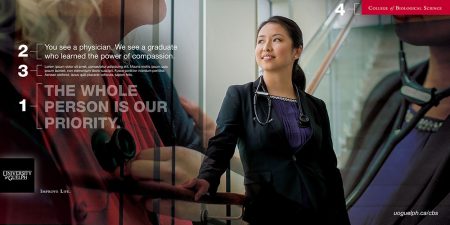
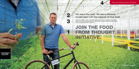
NOTE: The above 2 images are for illustration purposes only and must not be used in whole or in part under any circumstances.
(1) Title Message
The title message should summarize or position the topic of the communication in the context of U of G. The title message should be short.
Font specification:
- Helvetica Neue Bold (or 55 Heavy)
- All caps
- Colour: Use 75% to 50% opacity of black or white text depending on the lightness or darkness of the image. Accessibility and legibility must be considered.
Examples:
- THE WHOLE PLANET IS OUR LABORATORY
- JOIN THE FOOD FOR THOUGHT INITIATIVE
- IMPROVE LEARNING
- BLENDING SCIENCE WITH FINE ART
(2) Main Heading
The heading is intended to attract notice and inspire engagement. Be direct – but be interesting too. Tell just enough of the story to arouse curiosity or intrigue readers. Reference a U of G outcome in the context of a challenge. Headings may pose questions or be statements.
Font specification:
- Helvetica Neue Light
- Sentence Case
- Colour: Accessibility and legibility must be considered.
Examples:
- Can art cure illness?
- What you learn on campus is how you’ll lead off campus.
- Turn a garden into an economic engine.
- Some see independent learning as remote education. We see it as community building.
(3) Copy
Connect the first sentence to the heading and complete the thought or continue to inspire. Establish relevance and identify the scope of the challenge. In the second sentence, provide a U of G connection: an outcome, new research, an announcement. Space allowing, additional sentences should support the outcome with facts/features. The last sentence should connect back to the heading or first sentence, closing the loop with Improve Life.
Call to Action
- All University of Guelph communications should end with a Call To Action (see the Brand Narrative: How will you improve life while you are here – how will you improve life after you leave?). Calls To Action should lead to engagement of some form: visit the website, attend a conference, learn more, etc. Calls To Action help generate results that can be measured.
Font specification:
- Helvetica Neue: Any weight
- Sentence case
- Colour: Body copy on solid white should be screened at 85% black. Accessibility and legibility must be considered.
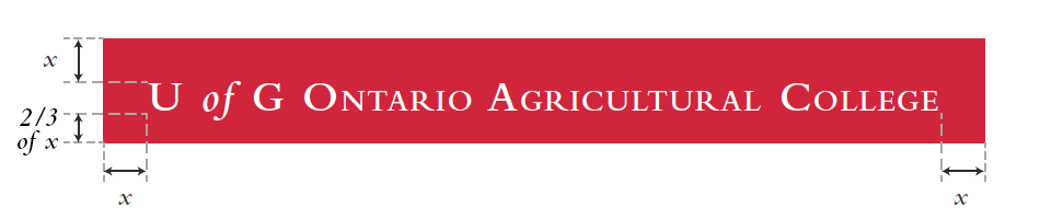
(4) College/Directorate Label
The college, unit or directorate name should be set reversed in a red banner and positioned on the top-right corner of the document – with bleed. “U of G” may be added before the name if appropriate.
Font specification:
- Bembo semibold
- Small Caps
- The word “of” should be typeset as Lowercase Bembo semibold italic
Example:
- College of Arts
- College of Business and Economics
- Banner specification:
- There should be space equal to the point size of the text from the left, right and ascender, to the left, right and top edges of the banner
- There should be a space equal to 66% (⅔) of the point size of the text from the baseline, to the bottom edge of the banner
- See illustration below. NOTE: X = Point size of the text.
URLs
URLS may be added anywhere in the layout. The “http://www.” should be dropped from the beginning of the url. For example, uoguelph.ca or uoguelph.ca/business
Font specification
- Helvetica Neue Italic
- Lower case