Skip to section on this page:
The Cornerstone – Our Primary Logo
The Cornerstone is the most important visual representations of our brand. Visually it helps our audiences recognize us and introduces our purpose: to Improve Life. The Cornerstone consists of the University of Guelph Identifier in white contained in a black square. The Cornerstone should be used with the Improve Life tagline for all external communications. It can only be used without the tagline for internal communications.
Usage
The Cornerstone with the tagline is the preferred logo for use on all external communications and its usage must comply with the specifications outlined below. The Cornerstone is property of the University of Guelph and cannot be used without expressed consent. When reproducing the Cornerstone, always use the authorized logo files from the electronic files provided in the guide.

With tagline:
- The tagline must be used with the Cornerstone on all external marketing communications and documents (such as brochures, banners, magazines, viewbook). This allows the recipient to become familiar with the brand, especially when encountering it for the first time.
- Formal documents such as reports, PowerPoint presentations or proposals must also communicate the full extent of the brand and therefore must carry the tagline. Templates are provided in the Resources section.
- It is preferred that the tagline appear in a lockup with the Cornerstone at a width equal to 75% of the Cornerstone. As an alternate option, the tagline may also appear apart from the Cornerstone as long as it appears in the lower-right corner of the same page or document that the Cornerstone appears on.

Without tagline:
- The tagline is not necessary for internal documents where current students, faculty, staff and other internal audiences should already be familiar with the brand.
- Exemptions can be made if space is limited such as smaller ads or on merchandise. Please contact brandguide@uoguelph.ca for exemptions.
Tip: If you are producing merchandise/swag and the item you’ve selected only has a one-colour imprint option, a special reversed one-colour version of the Cornerstone may be requested by emailing brandguide@uoguelph.ca. The white logo may also be used on a red or black item.
Minimum Size and Clear Space
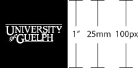
To ensure the Identifier within the Cornerstone is legible and visible, the minimum size of the Cornerstone is 25 mm / 1 in. / 100 px.
The mandatory minimum clear space around the Cornerstone – equal to 25% of the width of the square – must be incorporated into any design.
Documents with bleed: Depending on placement (see section below) the side of the Cornerstone that is flush with the edge of the page (left or right) is exempt from the mandatory minimum clear space.
If the size and clear space requirements for the intended use of the Cornerstone is less than the measurements specified, the University of Guelph Identifier may be used as an alternative. Please see the section on Secondary Logos for guidelines on proper use of the Identifier.
Placement
The Cornerstone must be placed in one of the following positions, while still adhering to the tagline usage rules and minimum clear space.
- Preferred position: flush left – positioned in the lower left quadrant of the document.
- Alternate position 1: flush left – positioned in the upper left quadrant of the document
- Alternate position 2: flush right – positioned in the lower right quadrant of the document
Placement Common Mistakes
Common cornerstone placement mistakes include:
- Cornerstone being flush to the bottom of the document.
- Cornerstone being flush to the top of the document.
- Cornerstone floating (ie. not being flush with either the left or right side of the document).
Design Do’s and Don’ts
Cornerstone Do’s
- Do ensure the Cornerstone is legible and visible.
- Do use the preferred positioning of the Cornerstone (flush left – lower left).
- Do leave a minimum clear space around the Cornerstone equal to 25% of the width of the square.
Cornerstone Don’ts
- Don’t alter the proportions of the elements of the Cornerstone.
- Don’t shrink, stretch or distort the Cornerstone.
- Don’t place the Cornerstone on an angle or on its side.
- Don’t integrate or combine the Cornerstone with other logos or graphic elements.
- Don’t print words or images over top of the Cornerstone.
- Don’t use the Cornerstone to promote an event or service that is not officially sponsored by the University of Guelph even if the event is held on campus.
Secondary Logos
The University of Guelph Identifier and crest are considered secondary logos. They are most appropriate for use on formal or internal communications produced by or for the University. Each secondary logo has specifications/usage rules.
The Identifier
The University of Guelph’s trademark Identifier is a stand-alone logotype. The Identifier may be displayed in black or red (on light backgrounds) or white (on dark backgrounds). For colour specifications refer to the Colour Palette and see examples below.
Stacked Identifier
Horizontal Identifier

Usage
The Identifier should be used when the available space is too small to include the Cornerstone or in situations where the Cornerstone would be unsuitable (i.e. not prominent enough). For example, the Identifier works well on promotional items where imprint locations are restricted and in applications where multiple external logos are placed together, such as a grouping of event sponsors or partners. Generally, the Identifier is not appropriate for marketing materials, such as advertisements, websites and banners. The Identifier is property of the University of Guelph and cannot be used without expressed consent. When reproducing the Identifier, always use the authorized logo files with official artwork from the electronic files provided.
Placement, Minimum Size and Clear Space
Placement: The Identifier may be placed anywhere where it will be legible provided the minimum size and clear space specifications are followed. The Identifier must be legible and visible. A mandatory “clear space” around the Identifier equal to the height of the capital “U” must be incorporated into any design using the Identifier.
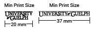
- Stacked Identifier: In print, the suggested minimum width of the stacked Identifier is 20 millimeters or .78 inches; for digital display, the minimum width is 100 pixels.
- Horizontal Identifier: In print, the suggested minimum width of the horizontal Identifier is 37 millimeters or 1.45 inches; for digital display, the minimum width is 175 pixels.


Do’s and Don’ts
Identifier Do’s
- Do use the Identifier when the space provided is too small for the Cornerstone, or if the Cornerstone is unsuitable.
- Do ensure the Identifier is legible and visible.
- Do leave a clear space around the Identifier equal to the height of the capital “U”.
Identifier Don’ts
- Don’t rotate the Identifier.
- Don’t reproduce the Identifier in an unapproved colour; permitted colours are black, red and white, no transparencies and not as a mask showing textures behind.
- Don’t distort or alter the dimensions.
- Don’t place the Identifier on a photo or design that makes it difficult to read.
- Don’t add a graphic element to the identifier such as a symbol or text.
- Don’t incorporate the Identifier into text or use in conjunction with other graphic elements or logos except as noted in these brand standards.
The Crest
The symbol commonly referred to as the crest is a design mark registered under the Canada Trade-marks Act. Eric Arthur and John Hall of the University of Toronto School of Architecture designed the University of Guelph crest in 1964. The three components of the design — the crest, shield and motto — represent the University’s links with the City of Guelph and the University of Toronto (the degree-granting body for the University of Guelph’s founding colleges before the University was incorporated in 1964). The white stallion in the crest links the University with the House of Hanover’s coat of arms. The name “Guelph” comes from “Welfen,” the family name of the House of Hanover, which intermarried with the English royal line. The three-part shield combines a book (symbolizing learning, the liberal arts and the University of Toronto connection), an astrolabe (symbolizing science) and a cornucopia (a symbol for abundance and agriculture). The crest and shield are used with or without the motto “rerum cognoscere causas” a quote from Virgil, which means, “to learn the meaning of reality.”

Usage
The crest is a ceremonial mark reserved for high profile ceremonial events such as convocation, citations and degrees, as well as specific materials from the Office of the President. It is not appropriate for use in external communications or marketing materials, and uses other than the aforementioned must be authorized by Communications and Public Affairs, and are only available by request. To submit a request, contact brandguide@uoguelph.ca.
Sub-brand Logos
A sub-brand is any brand associated with or operating under the University of Guelph parent-brand. This includes:
- Colleges
- Departments and schools
- Institutes and centres
- Campuses
- Initiatives and networks
- Internal and external services
Usage
External Communications
- As a general rule for all external communications, no other logo may compete with the Cornerstone.
- Sub-brands must use the Cornerstone and identify themselves using the sub-brand Label as specified in the Messaging Architecture section.
- A secondary sub-brand lock-up template is available for instances where the sub-brand label is not appropriate (e.g. letterhead, merchandise, swag, vehicles, social media)
- A select few sub-units have received special permission from the Director, Marketing and Digital Engagement to use their logos on external communications.
Internal Communications
Existing sub-brand logos may be used in internal communications provided that:
- The Cornerstone is also included in a prominent way
- The sub-brand logo includes the qualifier statement “at the University of Guelph” attached to it. For example:

- The sub-brand’s specific Graphic Guide is adhered to.
Sub-Brand Lock-up
All units are encouraged to use the sub-brand lock-up in place of unit logos. Usage and placement must follow the Cornerstone Guidelines. The Cornerstone of the lock-up should never be replaced by the identifier. The word mark of the lock-up may not be placed in other positions around the Cornerstone. Several lock-up templates have been developed to meet the varied needs of University of Guelph sub-brands and are available in three colour formats: black and red, all black and reverse (white).
Units can request a Lock-up by filling out the Lockup Request Form. Do not edit or change the files you are provided. Lock-ups are created and approved by the brand guide team.
Colleges, Campuses and Central Units/Services/Directorates

Departments, Schools, Centres, Institutes, Initiatives, Networks

Placement of Multiple Lock-ups and Logos
When multiple sub-brands are placed together, the Cornerstone must be placed in the layout only once. Sub-brand names should be placed next to each other, locked-up to the Cornerstone and be separated by a .5 line. The clear space between the sub-brand names and the lines is to be equal to 25% of the width of the Cornerstone square. 
Similarly, if an external logo must be used together with a sub-brand lock-up, the logos should be placed beside the sub-brand name and separated by a .5 line with clear space (equal to 25% of the width of the Cornerstone square) between the sub-brand name, lines and external logos.