Skip to section on this page:
Images, like all elements of the U of G brand, should reflect the attributes and intentions of our Brand Voice. Imagery is an important communication tool for telling U of G stories. The following guidelines apply to both original and stock photography and video, and may be either conceptual, literal or typographic.
Photos available for use by University of Guelph staff, students and faculty are located on:
Conceptual Images
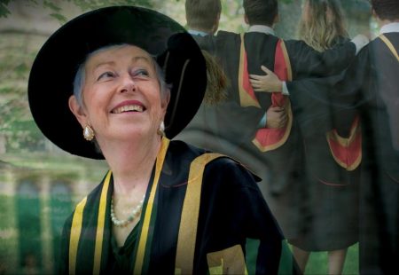
Conceptual images are best used as the main visual(s) in a communication piece to set up an overarching theme. These are visuals that communicate a specific Improve Life story by layering 2-3 images together.
Each layer represents a different aspect of the Improve Life story being told (i.e. the person(s), the work, and/or the outcome). The resulting composition tells a complete visual story of how an individual or group are engaged in work or activities that ultimately Improve Life.

*When planning shoots that involve laboratory subjects, it is mandatory that your subjects wear lab coats, any footage not adhering to this guideline can not be used.*
Tip: Consider adding touches of one of the U of G primary or secondary colours when styling/composing imagery. For example, a red sweater or yellow raincoat, trees in the fall, etc.
Note: All of the below images are for illustration purposes only and must not be used in whole or in part under any circumstances.

Literal Images
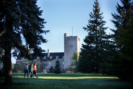
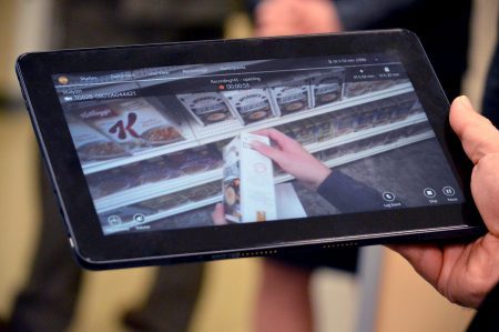
These are defined as singular images. Images should include a human presence. For example: person(s) as the subject or part of the composition or close-ups of parts of a person (i.e. hands, eyes, etc.).
Portraits of people should be in the context of who they are, what they do, or the story they want to tell. Preference is for “action” portraits as opposed to those shot in a studio.


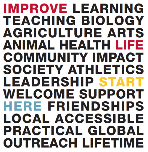
Typographic Images
A typographic composition may be used in place of images to communicate a complex message, provided that:
- It follows the colour composition(s) formula specified in the Colour Palette section
- It follows the font specifications for title outlined in the Messaging Architecture section
- It follows the voice tone and manner specifications in the choice of words/phrases as outlined in the Brand Voice section
- Words and/or phrases are clustered, aligned, and/or contained with purpose and structure whenever possible
- Scattered or disorderly compositions that feel too organic are avoided
Tip: Fuzzy or pixelated images are the result of low-resolution files. Resolution refers to the number of pixels or dots that make up an image. The higher the resolution, the more crisp and clear the image. Image resolution is measured in PPI (Pixels per Inch) for digital and DPI (Dots per Inch) for print. As a general rule, images should be at least 72ppi for digital/web and 300dpi for print.