The University of Guelph is launching a new look, evolving its brand for a new generation of Gryphons.
The changes include a new logo and typography for both the University and the Department of Athletics in two designs that support digital accessibility while retaining the original artistic intent of the brand.
U of G remains committed in its mission to Improve Life. As such, the updated visual identity signifies an evolution, not a rebrand, of current logo assets. This initiative marks a new chapter in the University’s brand history, says Dr. Rene Van Acker, interim president and vice-chancellor.
“The University of Guelph’s updated visual identity is compelling, powerful and elevates our position as one of Canada’s leading universities,” says Van Acker. “I commend the hard work of all members of the U of G community who had a hand in this ambitious project and ensured everyone felt represented. Our evolved brand will elevate U of G’s recognition locally, nationally and internationally.”
Deirdre Healey, associate vice-president, communications and marketing, adds: “Having a unified visual identity is essential in today’s competitive post-secondary landscape as U of G aims to elevate its brand and reputation on a global scale. The evolved brand will strengthen the performance of marketing and communications across the institution.”
U of G visual evolution strengthens brand connections
For the first time, the brand officially incorporates U of G’s Gryphon, connecting the University’s history with the rich legacy of Gryphon Athletics, which has been a vital partner in building U of G’s reputation and brand recognition.
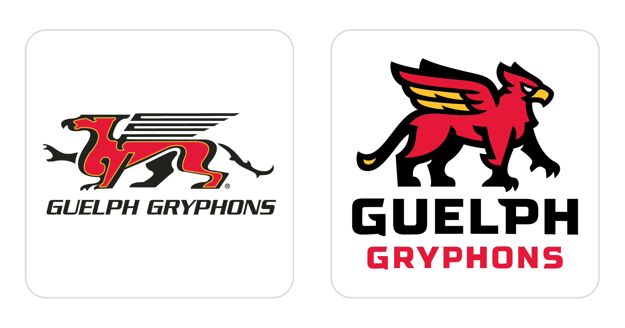
U of G’s Department of Athletics worked in close partnership with members of the central communications and marketing team to offer crucial design feedback and facilitate consultations with the community. That partnership has led to a new logo for the Guelph Gryphons, which will be donned by generations of Junior Gryphons, U of G athletes, students and alumni to come.
“Members of the U of G community are proud Gryphons, and the updated branding for the University and Athletics now embodies this shared identity,” says Scott McRoberts, director of Athletics.
U of G is soft launching the updated brand to allow for a gradual rollout, with a formal launch this September. Merchandise with the evolved brand is now available at the Bookstore and Gryph’s Locker. This timing allows U of G’s Athletics to prepare new uniforms for upcoming seasons. For Junior Gryphon teams, there will be no mandate to replace existing branded uniforms; they will be updated only when necessary or due for a change.
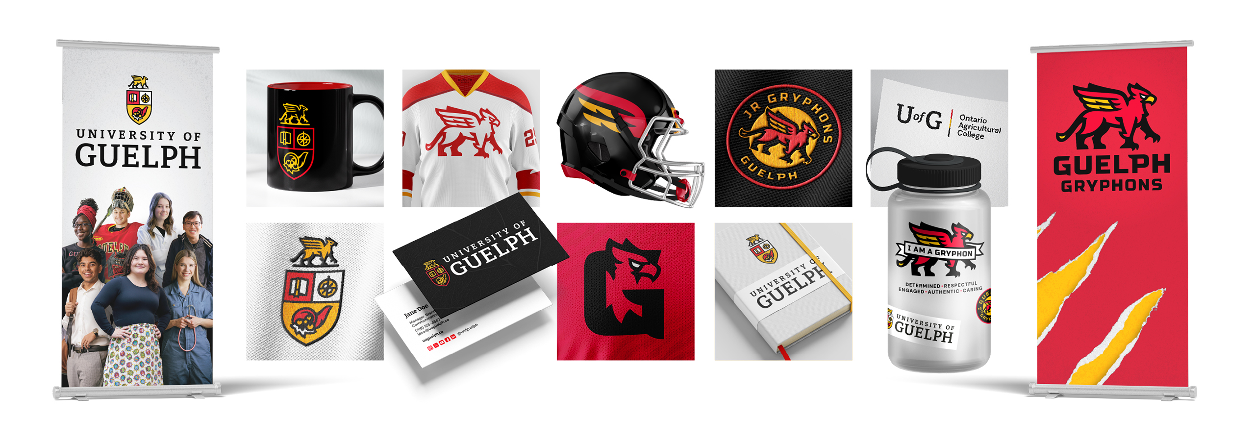
Inspired by U of G’s crest, designed in 1964, and the Gryphon name, officially adopted in 1967, the brand evolution weaves bold typography, vibrant colours and historic symbols into its original designs.
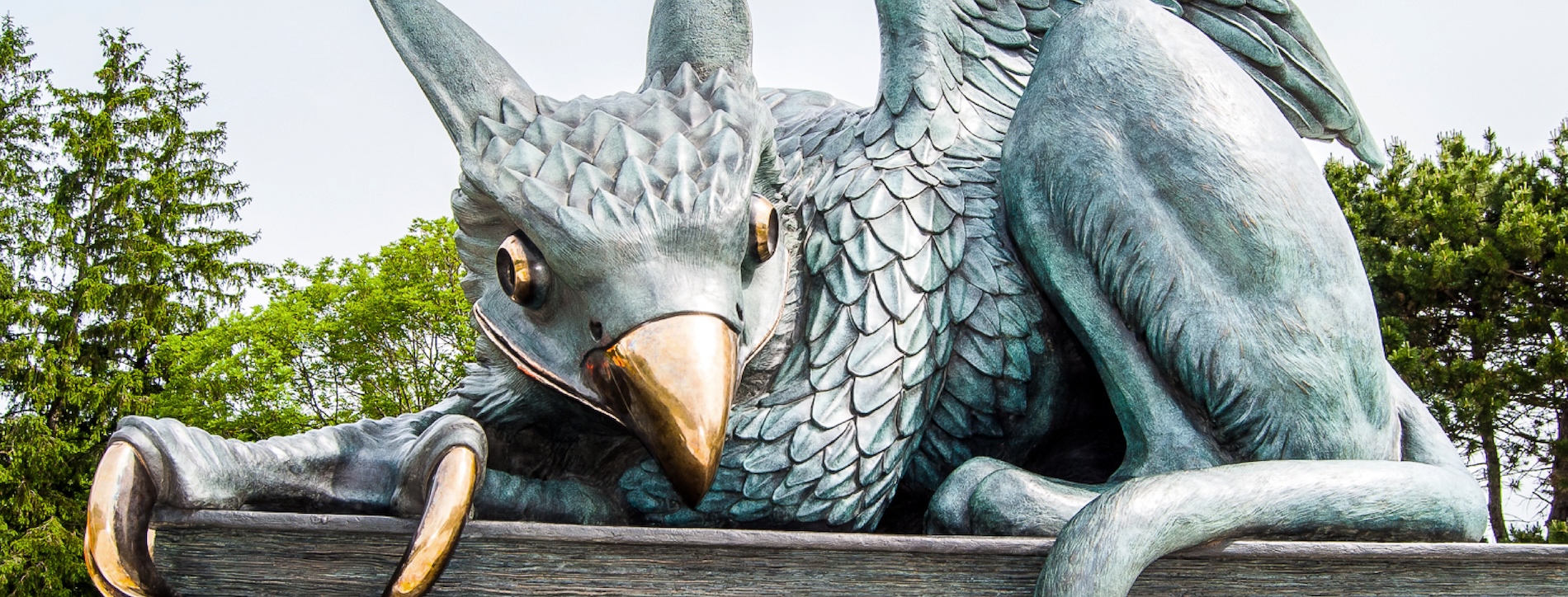
The newly crafted Gryphon now sits atop the new emblem, a design choice made to deepen the connection between U of G and its Department of Athletics. The new Gryphon takes inspiration from the current U of G mascot as well as the Gryphon statue, unveiled in 2014.
All logos and brand assets, including the refreshed emblem and wordmark, have been revitalized for print and digital media. Custom typography is now accessibility-compliant and emphasizes “Guelph,” the University’s main signifier, more clearly.
Designed in-house for our community, by our community
Lead designer Ethan Bersche, manager, brand strategy, collaborated with marketing and communications leaders across campus on the design process, with Michelle Pino, manager, marketing and communications in the Department of Athletics, partnering to develop the evolved Guelph Gryphons logo.
“If you’ve ever tried to create something with our logos, you’ll know they weren’t built for the modern world,” says Bersche. “We’ve been trying to shoehorn our brand into a competitive digital environment that didn’t exist when the logos were created. I’m really proud that the new look is so firmly rooted in accessibility, while meeting the needs of our community and environment.”
The final designs were shaped through consultations with students, faculty, staff, alumni, athletes, donors and industry partners led by Elizabeth Thomson, special projects manager, under the direction of Olya Yousefi, director of digital engagement and marketing.
“Our objectives were rooted in engagement, excitement and innovation,” says Yousefi. “The design strategy leveraged in-house talent and community consultation and resulted in an identity that strengthens our Gryphon culture and reflects our mission to improve life on campus and beyond.”
Digital initiatives will reflect the new visual identity within the first year, though many physical brand assets will remain on campus for several years, with signage and other physical assets being replaced at the end of their life cycles.
To learn more about U of G’s brand evolution, visit the official brand evolution website.